College Board Re-Brand
College Board wanted to shift from a house-of-brands to a masterbrand, effectively organizing its various business units under a single visual identity system. This was intended to reinforce a UX strategy aimed at presenting College board offerings in alignment with user journeys (e.g. planning for, and getting into college). The notion was that aligning business units through branding would make the work of serving user needs that spanned cross-platform a much lighter lift.
Strategy & Results
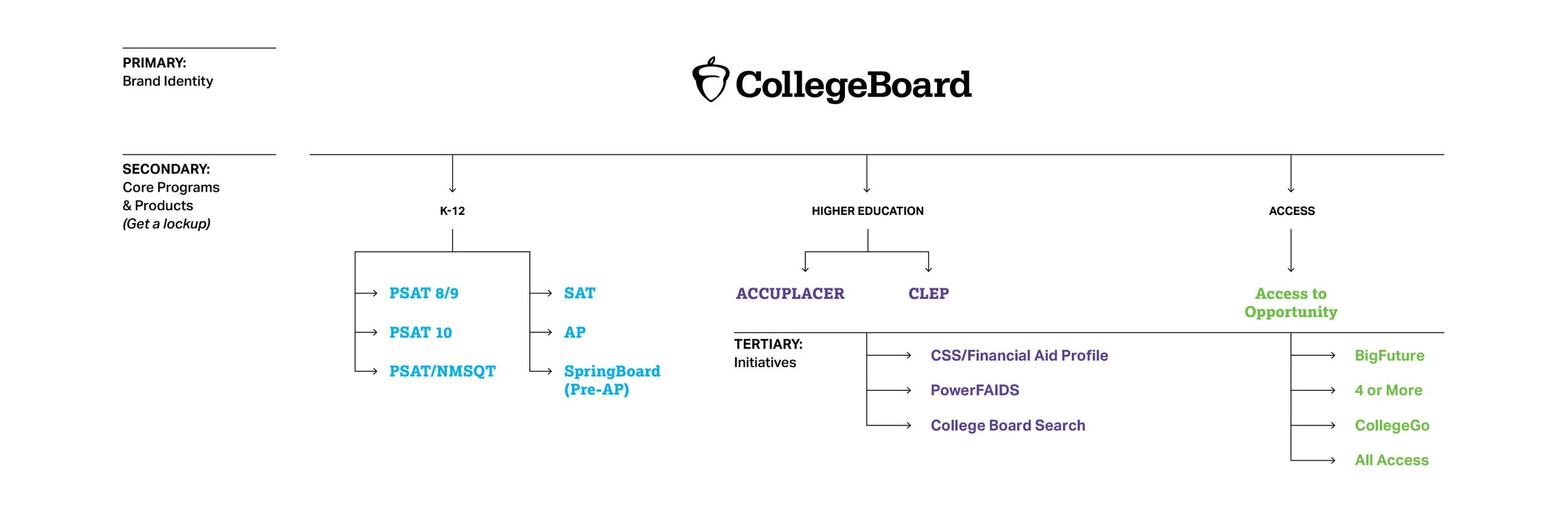
After many rounds of exploration, we settled on an approach we felt aligned with this purpose. Our theme was 'Focus'; we wanted to create clear steps along these user-centric pathways we were planning, and that clarity should resonate through all our branded media. We formed a brand architecture to reflect our master-brand structure, putting each business unit in its place within, as well as all our products and services. This structure provided a discernible basis for mapping our visual identity system.
Logo Refresh
The logo had received a refresh, but the logo alone did not meaningfully re-brand the College Board.
Brand Architecture
A major achievement of the branding work was this organization of business units under the enterprise, and gave us a reliable structure to base a design strategy on.
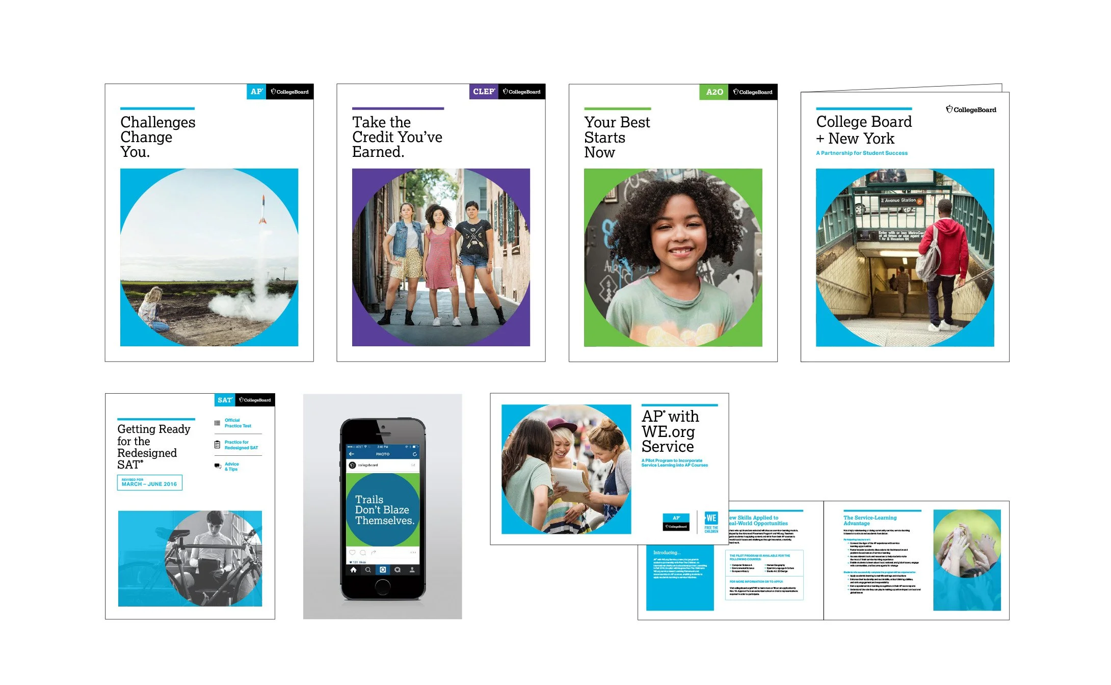
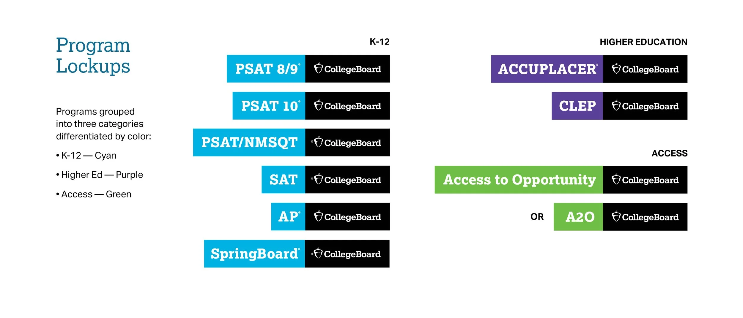
Program Lockups
Instead of allowing each business unit to form its own identity, we developed a logo lockup system based on our brand architecture.
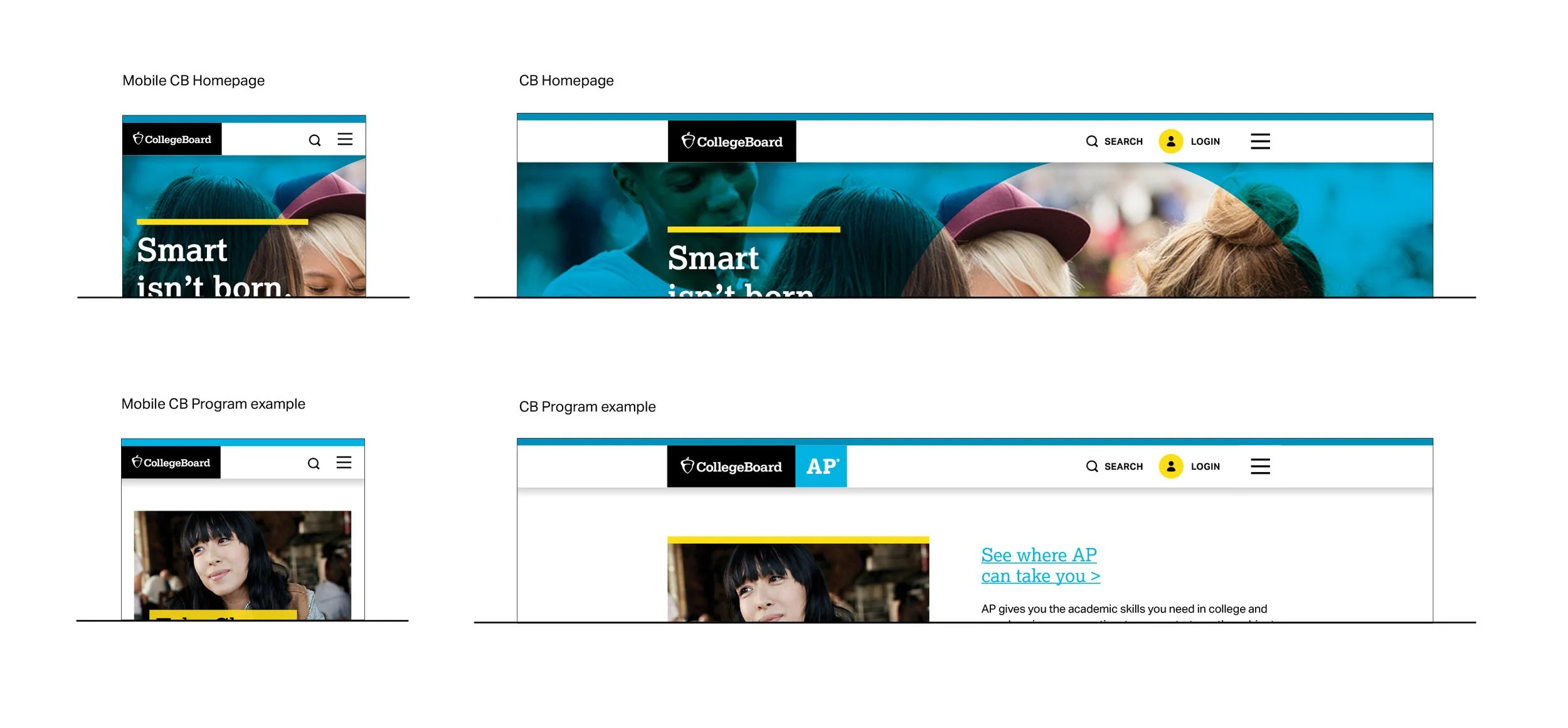
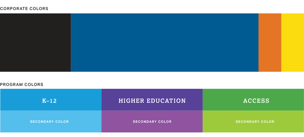
Color System
Our color system also had its basis in brand architecture and established a simplified palette.
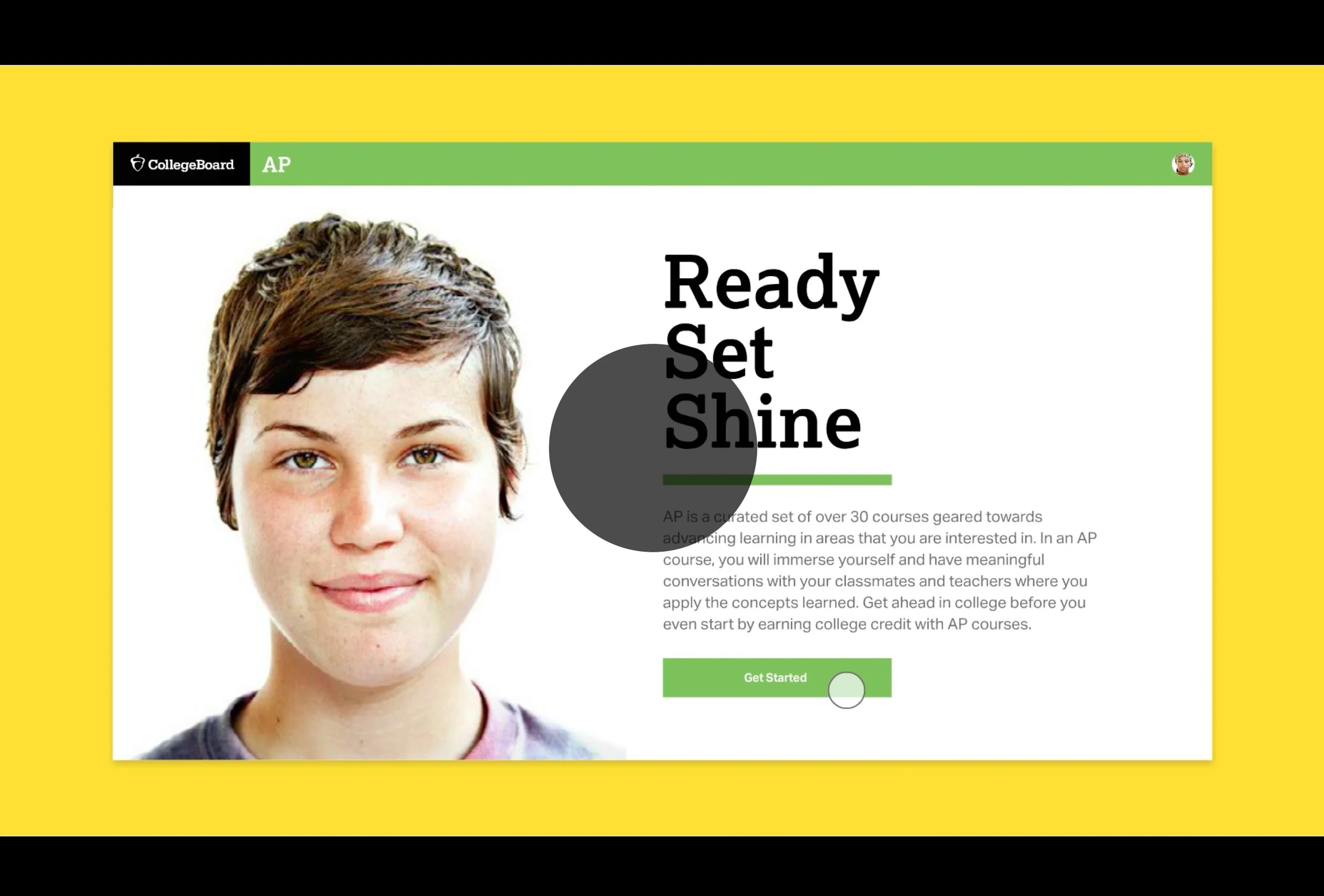
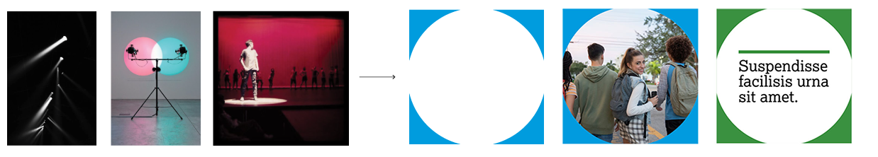
Focus Element
Sample Applications in Digital & Print Design